Digital to physical: user testing blender functionality
Applying user-centered design to physical products - user-testing blender functionality in partnership with the product development team.
CONTEXT
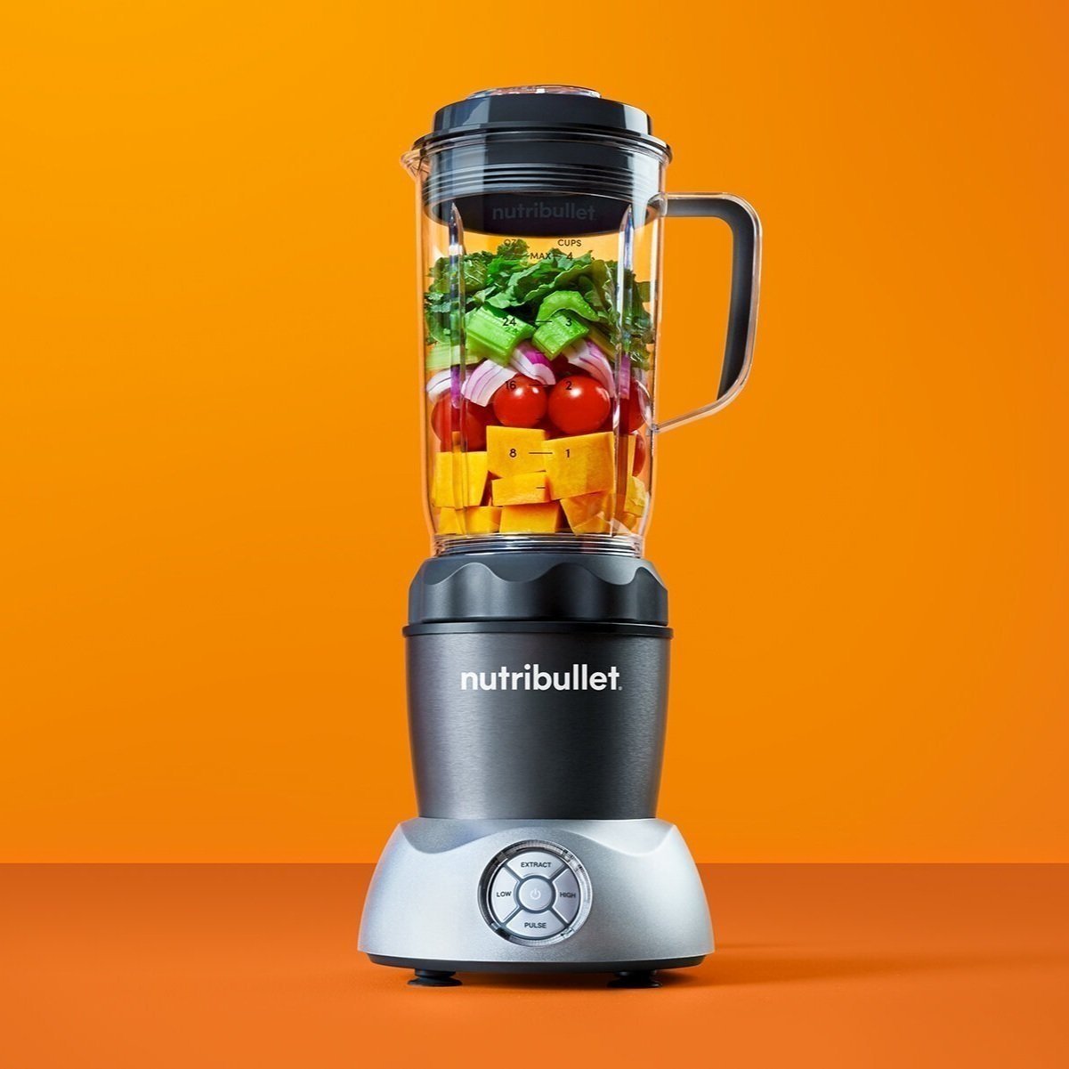
Nutribullet is known for single serve, personal blenders which are buttonless. This new model, Nutribullet Select, will be the first personal blender that offers versatile controls through a button interface. The product development team needed usability testing, specifically around the button interface, function, and CMF (color material finish).
This was a new experience for me! I’ve always designed with digital in mind, so it was a challenge to apply design thinking to a physical product. Though the terminology, cross functional partners and constraints change from physical to digital, the common thread is human-centered design.
How might we incorporate more functionality while keeping the product design consistent?
MY ROLE
I tested iterations of the button display from a user-centered approach from prototype to product launch. Methods included in-person, moderated focus groups, user testing, surveys, ideation with product development. I recommended the design that we launched with.
USER FLOW
I diagrammed a user flow and alternative use cases to understand blender functionality. The button interface utilizes LED light panels in order to communicate status and feedback to the user. The light interaction needed to be considered and tested.
TESTING BUTTON LABELS
I validated potential button labels with a survey to our target audience. Button labels should be clear, concise, and understood across our customers.
Attached is a table of some participant’s responses when asked to describe what each label means to them and their contextual mental models.
FOCUS GROUPS & USABILITY TESTING
I participated in focus groups with in-person interviews, in-person usability sessions with competitor products, and eight 2-hour focus group sessions in Chicago and Los Angeles.
The insights helped with divergent iterations of the button interface and the engineering constraints helped refine. We also learned that blender usage varies based on region!
Recommendations
After the feedback sessions with a prototype, insights were ranked on a severity scale. The table describes each issue and provides a recommendation to product development, engineers, and marketing
Severity scale:
- High: will prevent errors
- Medium: will enhance usability
- Low: will enhance aesthetics
Final Design
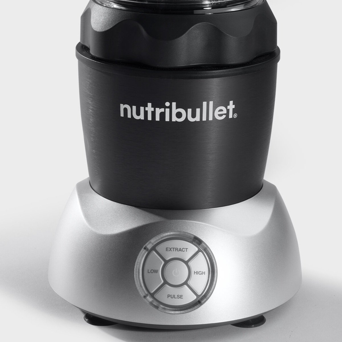
“Low” and “High” speeds align with the mental model of adjusting volume.
“Pulse” requires a manual touch to activate. I learned it’s easiest when users can rest their hand while using this function, so it made sense to place it at the bottom.
“Extract” is an innovative feature for this blender. We learned that this is the most popular function, so placing it at the top makes the most sense for hierarchy.
See the product on Nutribullet!


